This post will offer a framework for identifying, tracking, and visualizing key performance indicators. It applies to all company sizes — big and small.
Start by establishing the most important metrics for your business.
KPIs for Ecommerce
First, decide the reporting period. Weekly? Monthly? The answer usually depends on who is monitoring.
Senior management likely looks at the data once a month. Mid-level managers need it weekly, typically. Marketing and operations personnel who are implementing campaigns may require the data daily or even hourly. The good news is that many business intelligence tools allow for custom timeframes.
KPIs for ecommerce companies typically include:
- Revenue and profit. Choose whether to track revenue, profit, or both. Then, once decided, keep it consistent across all reports. Revenue and profit are typically the broadest KPIs.
- Number of customers. How many unique consumers have purchased from you?
- New customers. Understanding the percentage of new customers will help evaluate marketing performance and growth opportunities.
- Customer lifetime value. How much value does each customer represent? A quick calculation is to multiply a customer’s average order size by the estimated number of lifetime purchases.
- Average order size, company-wide. Divide total revenue by the total number of customers. An increasing average order size can indicate success with upselling or bundling products.
- Frequency of purchases. Divide the total number of transactions by the total number of customers. This will provide a rough indication of repeat buyers. Choose the period that is meaningful for your business — e.g., six months, one year, five years. The period usually depends on the type of products. A merchant selling baby clothes would likely not track beyond two years. But a merchant offering household cleaning items might use 10 years or more.
- On-site conversion. Divide the total number of customers by the number of visitors. This will provide insights into how your marketing identifies potential customers. Tracking total visitors can be helpful too, however, as it indicates brand awareness.
- Customer acquisition cost. Divide total marketing expenditures by the number of new customers. Ideally, your CAC will decrease over time with consistent promotional efforts.
Drilling Down
Once you’ve established your KPIs, set alerts and notifications for meaningful increases or decreases. Identifying problems quickly can prevent long-term damage. Drill down to the root cause, such as:
- Referral source. Did the customer come from a display ad or a social media post? How can the messaging be improved or, for successes, elevated?
- Geography. Do certain regions —countries, states, cities — produce more or fewer customers?
- Marketing spend. Can more marketing bring in new customers?
- Basket analysis. Which products are purchased together? Do customers buy multiple items from the same category? Different categories?
Identifying the cause of a problem KPI is not always easy. Often advanced analysis is required. For example, an increasing customer acquisition cost may have multiple reasons, such as new competitors, competing products, and a shift in consumer demand.
If purchase frequency is not increasing, consider a segmentation analysis for insights on marketing to specific consumer groups or for certain product categories.
Visualize
Charts and graphs can help interpret your KPIs. The type of visualization depends on the purpose.
- Bar or line graphs can show KPI trends over time for insights on seasonality and overall increases and decreases.
- Pie charts can visualize, for example, new versus repeat customers, or traffic sources by percentage.
- Map view can quickly display where your customers reside.
- Table view can produce side-by-side comparisons of multiple indicators, such as seasonality by product and traffic source.
Other helpful visualization tools in my experience include funnels (for multiple-step conversions), bubble charts (to understand high-performing products by, say, three metrics), and waterfall charts (to show how various components impact a metric, such as profit).
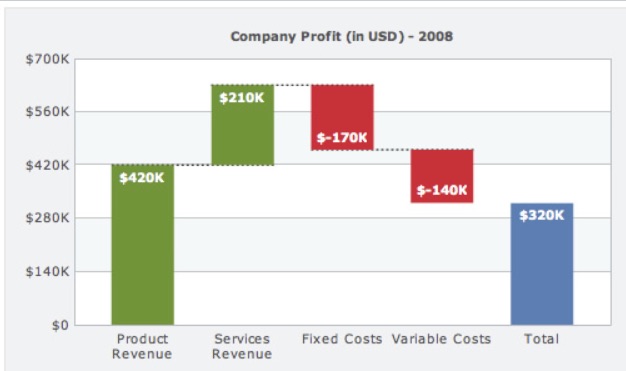
A waterfall chart can show how various components impact a metric, such as profit in this example. Source: Wikipedia.
April 26, 2020 at 10:21AM
via https//www.brucedayne.com/
Anna Kayfitz, Khareem Sudlow
