
The Windows 11 Start Menu has a mere sliver of the customizability of its predecessor.
The Windows 11 Start Menu sucks. At least in my humble opinion. The lack of customizability is a travesty for a company as big as Microsoft, particularly while working on a feature as important and embedded as the Start Menu.
In Windows 11, Microsoft is killing off Windows 8 and 10's Live Tile system, in favor of a simpler phone-like app icon interface, complete with a recommended box that surfaces files you may (or, may not) want to use. I get why they've done it this way — the Live Tile interface was too complicated for regular users. Finding apps that supported Live Tiles properly was not easy, and even then, configuring them to actually work for you can be a chore. As an IT guy in a previous life, I know all too well how virtually nobody in my organization bothered to customize their Live Tile setups, leading me to eventually just disable them via group policy.
What if there was another way, though? A way that could bridge the gap between customization and functionality? This simple but obvious change was explored recently by Gusion Claude, who emailed us this compelling concept below.
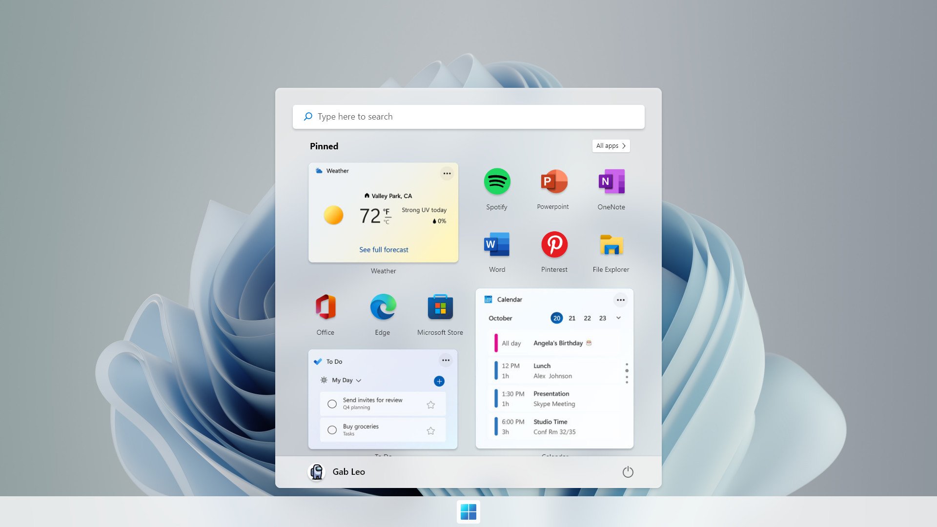
Start Menu concept from Gusion Claude.
In my previous article on the topic, I lamented the fact that much of the Live Tile at-a-glance information I've enjoyed for the past several years is being moved out to a separate panel, which I will most likely end up never using. I argued that the widgets should be present in the actual Start Menu, and Claude has essentially delivered on that idea.
Removing the horribly unconfigurable recommended box, Claude's Start Menu vision bridges the gap between Windows 11's elegant simplicity and Windows 10's configurable and informational design. Many apps simply do not need live tiles, like Microsoft Word, Photoshop, and so on. But I really enjoyed the Weather tile, the Photos tile, and the Calendar tile in particular. Some of that functionality remains in the new widgets panel in Windows 11, but as I said, it's an extra, unnecessary click.
I have no idea if Microsoft has even built the Start Menu with these kinds of capabilities in mind, but if their design teams had forethought, this is exactly how the Start Menu would work on Windows 11. Give me the option to combine the widgets panel and the Start Menu into a single customizable feed, you know, like my phone that you're clearly trying to emulate.
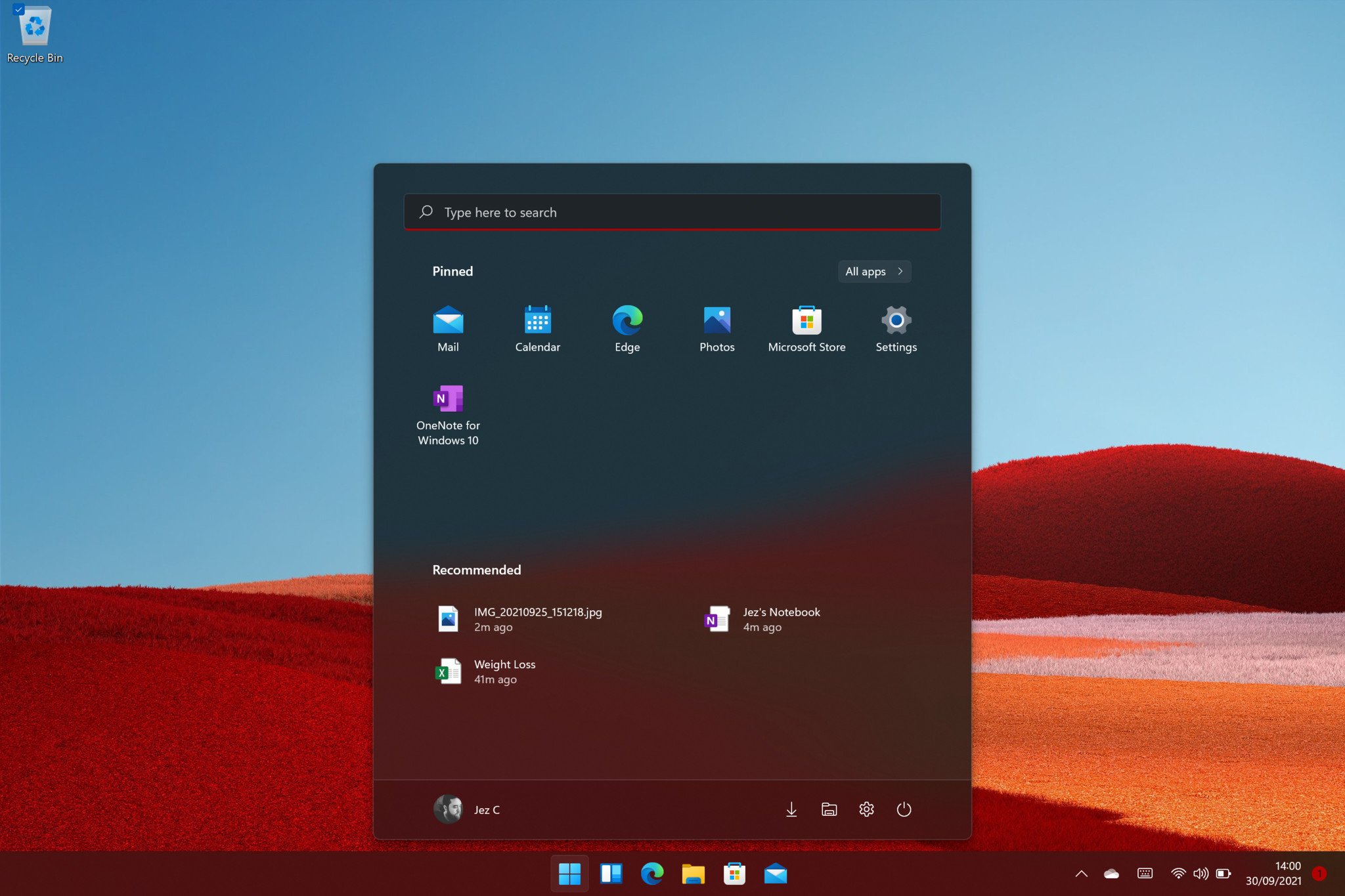
The official Windows 11 Start Menu, lame and uncustomizable.
If you want Windows 11 to be familiar to phone users, which is where I think some of this design ideology comes from, you need to make it as customizable as my phone too, Microsoft.
I'm sure none of this will happen in reality, with the more likely outcome being that Microsoft eventually just kills the widgets panel due to the fact nobody will use it. I'm sure people would use widgets if they were part of the Start Menu, though. Alas, one can dream.
via https://AiUpNow.com October 2, 2021 at 08:36AM by Jez Corden, Khareem Sudlow,
